
Typography Secrets That Make Self-Published Books Look Professional
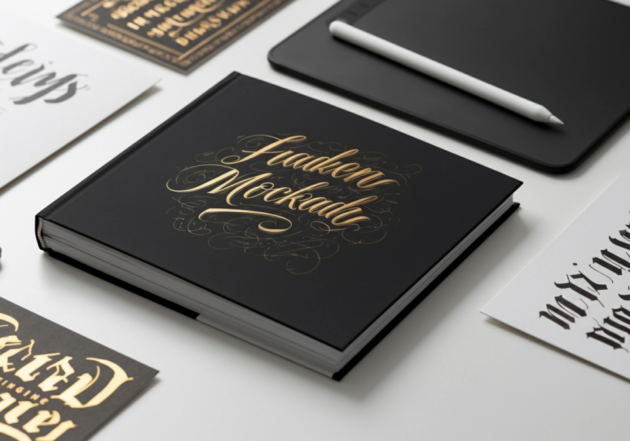
Typography Is the Silent Salesperson on Your Book Cover
Before a reader reads a single word of your blurb, they've already made a subconscious judgment about your book. That judgment is driven almost entirely by typography. The fonts you choose, how you size them, how you space them, and how they contrast with one another, and these decisions communicate genre, quality, and credibility in a fraction of a second.
For self-published authors, this is both a challenge and an opportunity. Traditional publishers invest heavily in cover design because they know typography sells books. The good news is that with the right knowledge, you can achieve the same professional results, without a design agency budget.
This guide breaks down the core typography principles that separate amateur covers from professional ones, with specific font recommendations and genre-by-genre guidance.
Font Pairing Principles: Contrast Without Clash
The golden rule of book cover typography is to use two fonts: rarely three, almost never more. The most reliable pairing formula is a serif combined with a sans-serif, because the contrast between their structures creates visual interest while maintaining harmony.
Why Serif + Sans-Serif Works
Serif fonts (those with small decorative strokes at the ends of letterforms) carry associations of tradition, authority, and literary weight. Sans-serif fonts feel modern, clean, and direct. Together, they create a dynamic tension that draws the eye and signals sophistication.
The key is contrast without clash. Your two fonts should be clearly different — not just slightly different weights of the same family. Pairing two similar fonts creates visual confusion; the reader's eye can't decide which to focus on. Pair fonts that are clearly distinct in structure, weight, or style.
Pairing Rules to Follow
- Contrast in style: Pair a decorative or expressive font with a neutral, restrained one
- Contrast in weight: If your title font is heavy and bold, let your author name breathe in a lighter weight
- Limit your palette: Two font families maximum; use different weights within those families for variation
- Avoid pairing two scripts or two display fonts; they compete rather than complement
Visual Hierarchy: Title, Subtitle, Author Name
Every book cover has three primary typographic elements: the title, the subtitle (if applicable), and the author name. Getting the size and weight relationships right is what creates a clear, readable hierarchy — the visual order in which the eye moves across the cover.
The Standard Hierarchy
In most genres, the title is the dominant element. It should be the largest, boldest typographic element on the cover. The subtitle, if present, is secondary — typically 40–60% of the title's size, often in a lighter weight or contrasting font. The author name is tertiary, though for established authors it may be promoted to near-title prominence.
Sizing Relationships
A reliable starting point for sizing:
- Title: 100% (your baseline)
- Subtitle: 45–55% of title size
- Author name: 30–45% of title size (or larger if you're a known brand)
These aren't rigid rules, but they give you a framework. The critical test is the thumbnail test: shrink your cover to the size it appears on Amazon's search results page. If you can still read the title clearly, your hierarchy is working.
Weight Relationships
Weight contrast reinforces size contrast. If your title is set in a bold or black weight, consider setting your author name in a regular or light weight of the same or complementary font. This prevents the cover from feeling heavy and gives each element its own visual space.
Kerning and Letter-Spacing: The Details That Define Quality
Kerning and letter-spacing are the typographic details that most readers can't consciously identify — but they absolutely feel. Poor spacing makes text look amateurish even when the font choice is excellent.
Kerning
Kerning refers to the space between individual letter pairs. Most professional fonts have built-in kerning tables, but display fonts used at large sizes often need manual adjustment. Common problem pairs include AV, WA, To, and Ty — letters whose shapes create awkward gaps when set at standard spacing.
At title sizes (anything above 60pt on a full-size cover), always review your kerning manually. Zoom in and look at each letter pair. If any gap looks noticeably larger or smaller than its neighbours, adjust it.
Letter-Spacing (Tracking)
Letter-spacing (or tracking) applies uniform spacing across a word or block of text. The general principles:
- Tighten tracking on large, bold display type — heavy fonts at large sizes often look too loose at default spacing
- Open up tracking on small text, all-caps settings, and light-weight fonts — this improves legibility and adds elegance
- Never tighten tracking on body text — it reduces readability
- All-caps titles almost always benefit from slightly increased tracking (5–15% above default)
Contrast: The Engine of Readability
Contrast is what makes typography legible and visually compelling. On a book cover, you're working with three types of contrast simultaneously.
Colour Contrast
Your text must be readable against the background. This sounds obvious, but it's one of the most common failure points on self-published covers. Light text on a dark background and dark text on a light background are the two reliable approaches. Avoid mid-tone text on mid-tone backgrounds — the result is muddy and unprofessional.
For covers with photographic backgrounds, use a text shadow, a semi-transparent overlay, or a solid text block to ensure your title remains legible across all viewing contexts.
Weight Contrast
Using fonts of dramatically different weights (say, an ultra-bold title against a thin, elegant author name) creates visual drama and guides the eye. This is a technique used extensively in thriller and literary fiction covers.
Size Contrast
Size contrast reinforces hierarchy. Don't be timid: the difference between your title and your subtitle should be obvious, not subtle. A 20% size difference is barely noticeable; a 50% difference creates clear, confident hierarchy.
Genre Conventions: Speaking the Visual Language of Your Category
Every genre has a typographic vocabulary. Readers have been trained by thousands of covers to associate certain font styles with certain types of books. Violating these conventions — even with beautiful typography — can confuse readers and hurt sales.
Thriller and Crime
Thrillers demand urgency, tension, and authority. The typographic language is bold, condensed, and high-contrast.
- Font characteristics: Condensed or extra-condensed letterforms, heavy weights, sharp edges, minimal ornamentation
- Recommended fonts: Bebas Neue (free, excellent for titles), Impact (use sparingly — it reads as generic), Oswald Bold, Anton, Barlow Condensed Black
- Colour palette: Black, deep red, white, cold grey — high contrast combinations
- Spacing: Tight tracking, often all-caps titles
- Avoid: Script fonts, decorative serifs, warm or pastel colour palettes
Romance
Romance covers communicate emotion, intimacy, and aspiration. The typography is expressive, often combining flowing scripts with elegant serifs.
- Font characteristics: Script or calligraphic title fonts, paired with refined serif supporting text
- Recommended fonts: Great Vibes or Pacifico for scripts; Playfair Display, Cormorant Garamond, or EB Garamond for serif pairings
- Colour palette: Warm tones, blush, gold, deep jewel colours depending on sub-genre
- Spacing: Generous, flowing — scripts should never feel cramped
- Avoid: Heavy condensed fonts, cold colour palettes, overly geometric sans-serifs
A note on script fonts: The romance genre is where script fonts shine — but only professional-quality ones. Avoid free script fonts that look handwritten in an uncontrolled way. Great Vibes, Allura, and Alex Brush are reliable free options with genuine elegance.
Business and Non-Fiction
Business and non-fiction covers communicate credibility, clarity, and expertise. The typography is clean, authoritative, and unambiguous.
- Font characteristics: Geometric or humanist sans-serifs, strong weight contrast, minimal decoration
- Recommended fonts: Montserrat (versatile, professional, free), Lato (warm but authoritative), Futura (classic, geometric authority), Raleway, Source Sans Pro
- Colour palette: Navy, charcoal, white, bold accent colours (orange, teal, red)
- Spacing: Clean and open — non-fiction readers expect clarity above all
- Avoid: Script fonts, overly decorative serifs, cluttered layouts
Specific Font Recommendations by Use Case
Here is a curated list of fonts with specific use-case guidance:
- Bebas Neue: Free. Condensed, all-caps display font. Ideal for thriller and action titles. Pairs well with Lato or Open Sans for supporting text.
- Playfair Display: Free. High-contrast serif with elegant proportions. Excellent for romance, literary fiction, and upmarket non-fiction titles.
- Montserrat: Free. Geometric sans-serif with multiple weights. The workhorse of non-fiction covers. Use Bold or ExtraBold for titles, Light for subtitles.
- Cormorant Garamond: Free. Refined, high-contrast serif with a literary feel. Superb for literary fiction, poetry, and upmarket romance.
- Oswald: Free. Condensed sans-serif with a strong, modern character. Works well for thriller subtitles and author names, or as a title font in its Bold weight.
- Great Vibes: Free. Flowing, professional script. The go-to for romance title accents. Use at large sizes only — it loses legibility when small.
- Lato: Free. Humanist sans-serif that balances warmth and professionalism. Excellent for author names and subtitles across most genres.
- Raleway: Free. Elegant, geometric sans-serif with distinctive letterforms. Works well for upmarket non-fiction and self-help titles.
All of the above are available on Google Fonts at no cost, making them accessible to every self-publishing author regardless of budget.
Common Mistakes to Avoid
Even with good font choices, these errors will undermine your cover's professionalism:
Using too many fonts. Three or more font families on a single cover creates visual chaos. Stick to two families, using different weights for variation.
Poor colour contrast. Grey text on a dark background, or white text on a light image, makes your title unreadable at thumbnail size. Always test legibility at small sizes.
Sending the wrong genre signals. A thriller with a flowing script font, or a romance with a heavy condensed sans-serif, will confuse readers and reduce click-through rates. Study the top 20 covers in your genre before finalising your typography.
Using amateur script fonts. Not all script fonts are created equal. Fonts like Comic Sans, Brush Script, or low-quality free scripts signal inexperience immediately. If you use a script, use a high-quality one.
Ignoring the thumbnail test. Your cover will be seen at 150–200 pixels wide on most retail platforms. If your title isn't legible at that size, it needs to be larger, bolder, or higher contrast.
Stretching or distorting fonts. Never manually stretch a font horizontally or vertically to fit a space. If you need a condensed look, use a condensed font. Distorted letterforms are an immediate quality signal.
Centring everything by default. Centre alignment is comfortable but often lazy. Left-aligned or right-aligned text can create more dynamic, professional compositions — especially when combined with strong imagery.
Conclusion: Actionable Takeaways
Typography is a learnable skill, and even small improvements can dramatically elevate the perceived quality of your book cover. Here's what to do next:
- Study your genre. Pull up the top 20 bestsellers in your category on Amazon and analyse their typography. Note the font styles, weights, and colour choices. This is your visual brief.
- Choose two fonts. One for your title (expressive, genre-appropriate), one for supporting text (clean, legible). Use different weights within those families for variation.
- Build your hierarchy. Title dominant, subtitle secondary, author name tertiary. Make the size differences obvious.
- Check your contrast. Test your cover at thumbnail size. If you can't read the title instantly, increase the size, weight, or colour contrast.
- Kern your title. At display sizes, review every letter pair manually and adjust where needed.
- Get feedback. Show your cover to readers in your genre — not just friends and family — and ask them what genre they'd expect the book to be in. If they guess correctly, your typography is doing its job.
Professional typography isn't about having expensive software or a design degree. It's about understanding the principles, respecting genre conventions, and sweating the details that readers feel even when they can't name them. Apply these secrets, and your self-published book will look like it belongs on any shelf — digital or physical.